Thursday, September 29, 2011

Thermal Effect


Learn how to convert your photos into Thermal Photo Effect.
Step 1: First open any image.
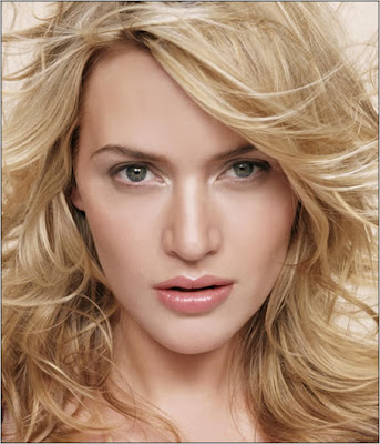

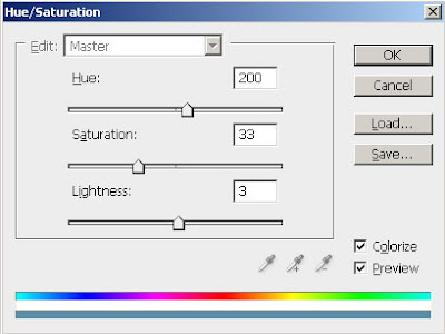
Step 2: First we apply Hue/Saturation, go to Image> Adjustments> Hue/Saturation or press Ctrl+U and apply these following setting:

Step 3: Duplicate the layer by pressing Ctrl+J and go to Filter> Blur> Gaussian Blur and apply these settings:
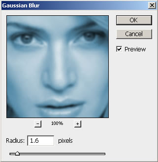

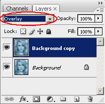
Step 4: Set the layer blending mode to 'Overlay'.

Step 5: Merge the layers together by pressing Ctrl+E. Again duplicate the layer and go to Filter> Blur> Motion Blur and apply these following setting:
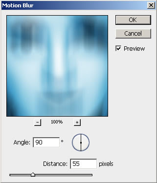

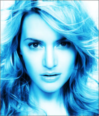
Step 6: Set the layer blending mode to 'Overlay' and merge the layer together.
After this your Image looks like this:

Step 7: Create a new layer and fill with white using Paint Bucket Tool.
Set this layer mode to 'Overlay' and do not merge.
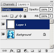

Step 8: Press 'D' to reset your color palette. Set your foreground color to #000099 and background to white. Create a new layer and fill with this color (#000099).
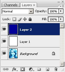

Step 9: Go to Filter> Render> Clouds. Set the layer blending mode to 'Overlay' and Opacity on this layer to 57%.
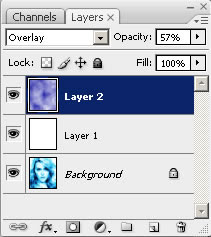

Step 10: In this step create a new layer again and fill it with white. Set the layer blending mode on this layer to 'Difference'.
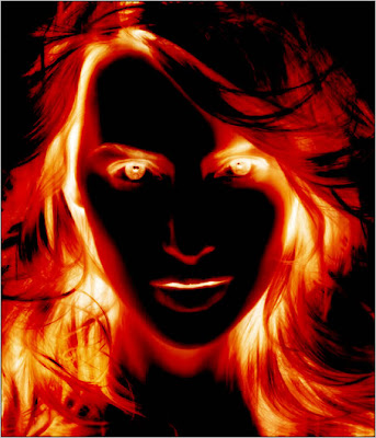

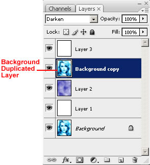
Step 11: In the Final step duplicate your background layer. Move this layer to 2nd from the top under white layer and set the layer blending mode to 'Darken'.

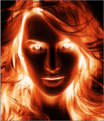
Here's is the Final Result!:
Wednesday, September 14, 2011

Aged Graffiti Effect


Turn your photo into a street artist's. We are even going to apply some age to make it appear to have been around for awhile.
Using an image from Photospin.com as the subject for my art.


The first thing I am going to do to this shot is remove the white background. This can be done a lot of ways (extract and so forth): in this instance I’m going to use the Background Eraser tool and wipe away the white. My settings for this tool are seen in the following two captures:


Since the background and her clothes are white, I can effectively wipe away all but the face, which is what I’m most concerned with. Using the other eraser tools I can take away the remains of her clothing and body, leaving just the head and neck


To tell the truth I’m really not interested in her neck either, so I’ll just select it with the Polygonal Lasso tool and delete that portion, leaving only the face.


There… that should do for now. Occasionally when converting images to art of some type, certain features that you may wish were enhanced are sacrificed for the effect. I’m concerned the eyes in this instance may not be as prominent as I’d like when this is complete, so I’m going to increase the size with Liquify>Bloat tool to see if it helps in the end.


I think that will do. Ok, not we can run it through the process of converting this to a really bad artist rendering. Yes, there is hope for those of us who draw poorly to make a splash in the artistic world… so long as you have Photoshop. Ok, let’s run the Artistic>Cutout filter. Here are my settings:


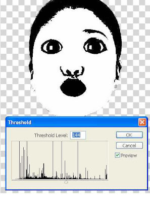
At this point you can retain the color if you so choose, but for this technique I’m going to wipe it away. I’m looking for a stark Black/White, and Image>Adjustments>Threshold will do nicely.


The last thing I’m going to do with this photo is select the Black. Select>Color Range will work for this. Then simply copy the selecting.


Time to change gears: we need somewhere to put the paint. Again, I’ve selected an image of a wall that has already seen some artist’s attention for my canvas:


Now I’ll paste the copied area from the first photo into the new image. It was a bit large, so I’ve downscaled it with the Transform tools so the new face will fit on the bricks above the other painting.


Using either Transform>Distort or Transform>Perspective, I can make the face appear to match the perspective of the wall.


So how do we blend this stark black paint to the bricks? You guessed it: Blending mode change. Set the Blending mode for this layer to Soft Light.


That does a pretty fair job of staining the bricks with the face, but we can do better than that. With Blend If we can wipe the paint away from some of the bricks and the cracks, giving the appearance that the painting has suffered some weathering. This is one of those added touches that can really make an effect, and it is fairly simple to do.

Open the Layer Styles for the face layer and go to Blending Options. We are concerned with the Blend If portion at the bottom center area of the dialog box. As we know that the bricks beneath have varying degrees of red, we can selectively wipe away some of the paint by selecting Blend If: Red in the drop down menu and then moving the Right slider beneath the Underlying Layer bar to the left. Take a look at my settings below.
As you move the slider watch the image and see the paint erode… too cool.


You’ll note that the paint is still in the cracks covering the mortar also. Again, manipulating Blend If can wipe this paint away so that the paint remains only on the surface of the bricks. By selecting Blend If: Gray and moving the left slider beneath Underlying Layer to the center, the paint in the cracks will also disappear.


Sunday, September 11, 2011

Add Adhesive Tape


Today's I am going to show you how to add adhesive tape to your photos.

Step 1: Open up a photo on which you want to add this taped down effect.
Place it to document which have you created in first step.


Step 2: So, we are going to rotate this picture a bit.
Go to Edit> Free Transform (shortcut key of 'Free Transfort Ctrl+T').


Step 3: We will make a tape. First create a new layer.
Then by using Rectangular Marquee Tool make a selection.
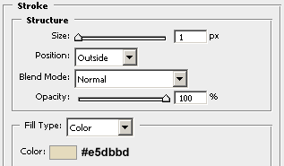
Fill it with white and press Ctrl+D for deselect the selection. Now go to Layer> Layer Style> Stroke and apply the following setting:


Now change the Fill of the layer to '40%'. After this your tape looks like:


Step 3: By using Lasso Tool make a selection like a picture shown below and press Delete.
This will add cut off effect to our tape.


Now go to Select> Deselect (Shortcut key Ctrl+D). Here's your result:


Repeat this process for the other side.

Step 4: Duplicate this layer by three times by press Ctrl+J and place each layer on different corner.
Rotate them Edit> Free Transform (Ctrl+T) so that they fit into your photo.

Here's the final result!


Wednesday, September 7, 2011

Blending Photos


We are going to replace the background behind a subject, but we will also have the model take on the texture and characteristics of the wall.
Step 1: First, using an image of a rather grumpy looking dude from Photospin.com.
Step 2: Set up the layers palette as follows. First, copy of the background so remove the man from the background without messing with the Background layer. Next, create a new layer between the two with the model present and fill it with black.
Step 3: Now we are going to conform a texture to the man's frame, and to do such I will be using a displacement map. I'll go ahead and create that now. If you are following along, go ahead and duplicate the Blue Channel in the channels palette.
Step 4: In this step we are going to bump up the contrast of the new channel in a couple ways. First, use the Shadow/Highlights filter on the channel. My settings are shown below.
Step 5: As with most displacement maps, this will need some blur applied. Apply a Gaussian Blur as seen here.
Step 6: In step-6 bump up the contrast a bit on the channel. My settings are seen below.
Step 7: Once satisfied with the displacement map, save it to a new file, name it, and save it to your hard drive.


Step 8: Close the map once it has been saved. Return to the original image and delete the Blue Copy channel. You won't be needing it any more.
Step 9: Return to the layers palette. Using your favorite selection tool, select the man separate from the background. In this step used the magic wand tool with Add To Selection turned on, selected the background, then inverted the selection.
Step 10: Once your selection has been made, click the Add a mask icon on the bottom of the layers palette. The background will disappear to reveal the black layer beneath.
Step 11: Now open a background image that is fairly close to the size of the original photo. In this case I am going to use a stone wall (or perhaps a stone path) as my pattern of choice. This image is also available at Photospin.com.
Step 12: Make a copy of the stone image and paste it into a new layer beneath the top most layer with the man present, but above the black layer. Don't worry if the image is smaller than the original as seen here: we can fix that in a bit.

Step 13: Duplicate the wall layer and place the new instance of the wall at the top of the layer stack.
Step 14: For this top layer, go ahead and use the Edit => Transform => Scale function to increase the size of the layer so that the entire image is covered.
Step 15: Command/Control+Click the mask on the man layer to generate the selection again. Run the Displace filter with the settings seen below on the selection.


Step 16: Select the inverse and hit the Delete key. This will wipe away the extra stone, leaving only the man covered. Change the Blending Mode for this layer to Overlay. The results can be seen below so you can sheck your progress.


Step 17: Now use the transform tools to increase the size of the stone layer behind the man.
Step 18: Duplicate the top layer and change the blending mode for the new layer to Soft Light. This just helps enhance the features of the stone on the man.
Step 19: Adjust the Saturation of the Soft Light layer, decreasing the Saturation to -80 or so.
Step 20: Reduce the saturation of the Overlay layer also, but only adjust this to about -60.
Step 21: We can still tone this down a bit further. Create a Hue/Saturation adjustment layer just above the man.


Step 22: You should be getting a fairly decent blend of the subject with his background.
Step 23: As a result of using the Displace tool, some stretching of pixels has occurred on the stone-man layers. If this is the case, first select the stone-man overlay layer, and clean up these stretch marks around the eyes, lips and edges by taking samples of unstretched stone with the Healing Brush and applying the pattern to the stretched areas.


The image shows the man after the clean-up process.
Step 24: Last things to do is reveal the eyes and lips again. To do this simply create masks for the stone-man layers and paint over those areas with Black in their respective masks.
Step 25: Final thing, some shadow would do nicely to make him stand out from the background just a bit. Using the Burn Tool on the stone background and running it around the man's shoulders and head should work nicely. My Burn Tool settings are seen here:
The final image is seen here: