Saturday, July 31, 2010

Publishing to the World Wide Web

After you’ve found where to park your website, you’re now ready to publish your pages to the World Wide Web. There are a couple ways to do this:
  • Using a web editor that has File Transfer Protocol (FTP) capability. Dreamweaver contains FTP capability, which makes it easy to transfer files.
    After connecting to your web hosting server, you simply “drag and drop” files using Dreamweaver.
  • Using a standalone FTP program. You can go to www.download.com. In the Search field at the top of the page, type FTP.
    You’ll find several free FTP programs that you can download. Some good ones include Coffee Cup Direct FTP, CuteFTP, FTP Explorer, and FTP Voyager.

Using Dreamweaver to Publish to the World Wide Web

Dreamweaver allows users to connect to a web server so you can use its FTP functionality to upload and update your web pages on the World Wide Web. Perform the following:
  1. In Dreamweaver, select SiteManage Sites from the menu bar. The Manage Sites dialog box displays, as shown in figure below.


  2. The ConFigure Server dialog box displays, as shown in figure below.

  3. Complete this dialog box with your web server information and click OK. This dialog box allows you to connect Dreamweaver to a remote server using FTP access.
Once you’ve defined this information, Dreamweaver will conFigure your computer to the remote server. The Files panel (within Dreamweaver) will then display the contents of the remote server folder you connected to, and the server name appears in the pop-up menu at the top of the panel. You can then use the Put and Get arrows in the Files panel to upload and download web page files. Once files are uploaded, you can also work on them directly over the web by double-clicking them within the Files panel.

Tip 
You only need to complete the ConFigure Server dialog box once for each server to which you wish to connect.
Your web hosting provider can provide you with the correct information for this dialog box. Here’s a summary of the information you’ll need for the ConFigure Server dialog box:
  • Name: Here you can create a name that appears in the pop-up menu within the Files panel. This name can be anything you like.
  • Access type: You’ll usually select FTP.
  • FTP host: This is the name of the FTP host to which you’ll upload your files.
    The FTP host is the full Internet name of the computer system, and usually looks something like ftp.hostserviceprovider.com. You don’t need to add the protocol name in front of your FTP name (for example, you don’t need to add http://).
    Your host service provider can provide you with this name.
  • Host directory: This is the area of the remote site where you’ll store the web pages that are visible to the public.
    Your host service provider can help you with this information if necessary.
  • Login: The login name to connect to the FTP server. Your host service provider can provide you with this name.
  • Password: The password to connect to the FTP server. Your host service provider can provide you with this word.

  • Use passive FTP: Use this if your firewall configuration requires use of passive FTP. Passive FTP allows your local computer (rather than the remote server) to set up the FTP connection. Check with your system administrator if you’re unsure whether to use passive FTP.
    Most users will probably keep this check box blank. However, if you’re on a company network, your system administrator may wish to set up the FTP connection locally (using passive FTP) for security reasons.
  • Use firewall: Allows you to connect to the remote server from behind a firewall. Check with your system administrator if you’re unsure whether to check the Use Firewall check box.
    For most users, you’ll probably keep this check box blank. However, if you’re on a company network, your system administrator may wish to set up an FTP connection behind your local firewall for security reasons.
  • Use Secure FTP (SFTP): Allows for secure FTP authentication. SFTP uses encryption and public keys to secure a connection to your testing server.
In this tutorial:
  1. Going Live with your Website
  2. What Kind of Website are you Publishing
  3. Publishing to the World Wide Web

What Kind of Website Are You Publishing?

What kind of website are you planning to publish? It probably falls into one of these categories:
  • Personal (or hobby) website
  • Business website
  • E-commerce website
Why worry about the type of website you wish to publish? Aren’t all websites the same? Sure, there’s different types of information from one website to another, but why worry about the type of website you’re publishing?
The answer is this: Depending on the type of website you’re putting up, you need to consider the file space your website needs and the expected traffic load of your website. You don’t want to get your website up and running only to find that you’ve already run out of your allotted space.

Personal (or Hobby) Websites

Personal (or hobby) websites are those you create to communicate with family or friends. Personal sites also include those dedicated to your hobbies, as well as fan sites. These types of websites are usually small and won’t bring much Internet traffic (at least not at first).
For these kinds of websites, check out free web hosting services. Some free web hosting services that come to mind are as follows:
  • Your Internet service provider (ISP). Many of these provide their customers with the ability to publish personal web pages as part of their service. There may be size limits with these sites. Often, you can buy extra file space for a small fee.
  • Free web hosting services. These include websites such as www.geocities.com, www.homestead.com, and www.tripod.lycos.com. You’ll get a free place to park your website; however, usually the host then gets to place advertisements. You can get rid of these, but there is usually a small fee.
These sites also have size limits, which you can increase, again for a small fee.

Note 
With these free sites, you may not be allowed to use your own top-level domain (TLD) name unless you upgrade your type of account (usually for a small fee). Thus, instead of www.tullfamily.com, you’d be stuck with something like www.freehostservice.com/members/~tullfamily/index.html.
Although that may not matter to you (especially if your website’s a personal website), such a name may not look professional if your website is for a business.

Business Websites

There are a couple of different business website styles. Some business websites are essentially online versions of their brochures. These websites usually provide information about the company, its services, past experience, and contact information. You can probably get away with hosting such a website on your ISP or with a free web hosting service such as those mentioned in the previous section.
You’ll want to use a top-level domain for business sites, and one that isn’t too long or too difficult to read. Pick a website name that’s easy for visitors to read and remember. You’ll also want to pick a name that’s easily printable (and readable) on printed literature and business cards.

Tip 
Check out your web hosting service. Your web host may offer a domain name free for a year when you sign up for a yearly hosting account.

E-commerce Websites

What if you want to create a website that sells products and services online (thus requiring the need to accept online payments)? Here’s where things can get complicated (and more expensive). You’ll probably want to shop around for a web hosting company that supports e-commerce.
The following are some tips on finding a good web hosting company for your e-commerce website:
  • The company should be able to help you with taking credit card orders online.
  • Avoid hosting companies that imply they can get you a merchant account. These are only available from banks.
  • Find a web host provider with at least one T-3 (45 Mbps) line connection to the Internet’s backbone, or to an “upstream” provider. Make sure the average bandwidth used is not greater than 30% of the available total.
  • As a rule of thumb, 25 MB of hard disk space holds about 500 web pages. Make sure the web hosting provider provides around this much disk space, with the ability to increase size easily. Also, make sure you can increase your disk space with a simple phone call.
  • An added plus is if the web hosting provider has easy-to-use software (like SoftCart or ShopSite) for building online catalogs.
  • Make sure the web hosting provider will help you with website security for your online transactions.
  • Prices vary, but expect to pay at least $100 per month. Startup fees can range from $50 to $150. Software (such as catalog applications) can range from $300 to over $3,000.
In this tutorial:
  1. Going Live with your Website
  2. What Kind of Website are you Publishing
  3. Publishing to the World Wide Web

Going Live with Your Website

The material in this chapter should help you find the best place and method for posting your web pages to the World Wide Web. The best solution for your web hosting needs depends on the type of website.

In this tutorial:
  1. Going Live with your Website
  2. What Kind of Website are you Publishing
  3. Publishing to the World Wide Web

Friday, July 30, 2010

Creating Background Images

Like you did in previous tutorial, let’s first define our background images before going any further. Dreamweaver’s Properties inspector is where you’ll perform the following:
  1. Select each of the images within the Dreamweaver tables and hit your Delete key. This removes them from the Designer Layout. Don’t worry, though; you’ll add them back in a moment.
  2. Select the first cell in your table (the one that held your title bar). Now, press the folder next to the Bg field in the Properties inspector. The Select Image Source dialog box displays.
    The Bg field is where you define background images.
  3. In the Select Image Source dialog box, go to the folder that contains the images for your web page. (Photoshop saved this folder in the same location you saved your web page.)
  4. Select the title bar image (it may be Simeon_home_01.gif). If you’re not sure, press the View Menu icon. This is the icon next to the Look in drop-down field. From the View menu, select Thumbnails.
  5. Press OK. You’re returned to the Designer Layout. Notice this image displays in your web page. If you look at the Properties inspector, the Bg field displays the Simeon_home_01.gif image. That means this image now is a background image.
Continue working your way around the table cells. Add the appropriate images again as background images using the Properties inspector.


Tip 
You may need to adjust the tables as you add these background images. Sometimes too much of the background image displays and you see tiling. Other times you’ll find that too little of your background image displays, thus cutting off half of your image.
You can adjust tables by placing your cursor over a table border. Your cursor will change into a double parallel line with two arrows pointing in opposite directions. Click and drag your mouse over a table border, and you’ll find yourself adjusting the size of a table cell.

In this tutorial:
  1. Designing a Modern Web Page Style
  2. The Simeon Software Group
  3. Creating the Navigation Bar Layer
  4. Creating a Watermark Layer
  5. Adding Menus to the Navigational Bar
  6. Creating Colored Menu Selections
  7. Adding Photos to Your Web Page
  8. Editing your Web Page in Dreamweaver 
  9. Creating Background Images
  10. Silver and Backgrounds

Slivers and Backgrounds

Remember the gradient background and sliver you created in previous tutorial? Let’s add these now to the San Simeon web page. Perform the following steps:
  1. In Dreamweaver, click and delete the center contents area of your web page.
  2. Press the folder next to the Bg field in the Properties inspector. The Select Image Source dialog box displays.
    The Bg field is where you define background images.
  3. In the Select Image Source dialog box, go to the folder that contains the grn-grad.png image you created in previous tutorial.


  4. Press OK. You’re returned to the Designer Layout. Notice this image displays in your web page, as shown in figure below.

Drawing a Layout Table Cell

Notice that your background image tiles. Your image’s width blends seamlessly, but the height tiles over and over. Let’s correct that now with the sliver you created in previous tutorial.
  1. In the Dreamweaver Insert bar, select the Layout mode. Then select the Layout view (next to the Standard and Expanded modes), as shown in figure below.
  2. Select the Draw Layout Cell option in the Insert bar.
  3. Click and drag your mouse to make a new table cell within the contents area. Cover up the bottom two background images that tile, as shown in figure below.
  4. Click the [exit] hyperlink at the top of your web page (next to the Layout mode text) to exit the Layout mode. Notice your background images are gone, and the center contents area is now divided into two cells.

Merging Cells

Unfortunately, you may notice the right and left sides of the screen now tile. This is easy to correct. Let’s merge some table cells on your screen to get rid of some of this tiling.
  1. Click and drag your mouse over the two cells on the right side of your web page. These are the cells that contain the colored menu selections.
  2. Release your mouse. Then right-click within this selected area. A pop-up menu displays. Select TableMerge Cells from this menu, as shown in figure below.

Once you release your mouse, these two cells on the right side merge. You should see only one instance of the color menu selections. These should not tile.
Do the same for the navigation menu on the left side of your web page (merge these two cells). Once you’ve done this, you’re ready to add your background and sliver images.

Adding a Background and Sliver Image

In the top cell, add the grn-grad.png file as a background image. In the bottom cell, add the grn-grad-sliver.png file as a background image. Your screen should look like figure below.

Adding Content

To finish up your web page, add some content and maybe a navigational footer at the bottom of your web page. Then preview your page in a web browser. Try to make your web page look like figure below.

In this tutorial:
  1. Designing a Modern Web Page Style
  2. The Simeon Software Group
  3. Creating the Navigation Bar Layer
  4. Creating a Watermark Layer
  5. Adding Menus to the Navigational Bar
  6. Creating Colored Menu Selections
  7. Adding Photos to Your Web Page
  8. Editing your Web Page in Dreamweaver 
  9. Creating Background Images
  10. Silver and Backgrounds

Editing Your Web Page in Dreamweaver

Now the fun begins — filling your image with content. ImageReady creates an HTML file you can hand code, or you can simply open your HTML file in your favorite web editing program and add your content just like you would a word processing document.
Although we’ve used Dreamweaver throughout this book for our web editing, you can use various programs, including FrontPage and GoLive. You could even use Notepad if you so wanted. The choice is up to you.
  1. Fire up Dreamweaver. Then, open your Simeon_home.html page. Your screen should look like figure below.


  2. Add various text within your page. Remember to use a sans-serif font like Verdana. Also, a gray font works nicely in breaking up the white space. Add some text — whatever the client wants.
In this tutorial:
  1. Designing a Modern Web Page Style
  2. The Simeon Software Group
  3. Creating the Navigation Bar Layer
  4. Creating a Watermark Layer
  5. Adding Menus to the Navigational Bar
  6. Creating Colored Menu Selections
  7. Adding Photos to Your Web Page
  8. Editing your Web Page in Dreamweaver 
  9. Creating Background Images
  10. Silver and Backgrounds

Adding Photos to Your Web Page

Everyone likes pictures. Adding a few images of things relevant to the site can help a website appear more inviting. You don’t want to fill your pages with text only. Too much text will scare visitors away.
Since the San Simeon Software group provides network, software, and customer service services, let’s find three images that capture these themes, as shown in figure below.

Once you’ve got these files open, let’s tweak them a bit. Not only is Photoshop a great program in which to create shapes, but it’s also a great program for adding special effects to your images. Let’s explore some of these different effects.

Replacing Traditional Photography Filters

Photoshop can easily reproduce many photography filters — things the pros use to warm or cool pictures to create a more dramatic mood for a photograph. Perform the following to get a taste of Photoshop’s digital photography filters:
  1. Select the software.jpg image. This is the image to which we’ll apply a lens filter effect.
  2. In the Layers palette, select the Create New Adjustment Layer icon. This icon is the half black and half white circle icon at the bottom of the Layers palette.
  3. A submenu displays. Select Photo Filter from this submenu, as shown in figure below.
  4. The Photo Filter dialog box displays. Click and hold on the Filter drop-down field. A list of filters displays. Select Cooling Filter (82), as shown in figure below.


  5. If you want to make the blue a little more dramatic, move the Density slider to the right. Let’s move it from 25% to about 75%. Then click OK.
  6. Go to ImageImage Size. Change the Width and Height to 25%, then click OK. You’ve now shrunk your image.
  7. Press Ctrl+Shift+E to merge all visible layers. Then, drag it onto the San Simeon Software image, somewhere below the Solutions colored menu.

  8. Select the layer this software graphic is on. Change the name of the layer to software, then change the opacity of that layer to 50% (using the Opacity drop-down field on the Layers palette).
    Your image should look like figure below.

Dodging and Burning Your Photos

Dodging and burning allows you to tweak the lightness (dodging) and darkness (burning) of images. Unfortunately, the dodging and burning tools available in Photoshop don’t allow much control. Not only do they not allow you to control the dodging and burning easily, but they also screw up your original image data.
There’s a better way to get dodging and burning results with your photos in Photoshop — a method professional designers use. Perform the following:
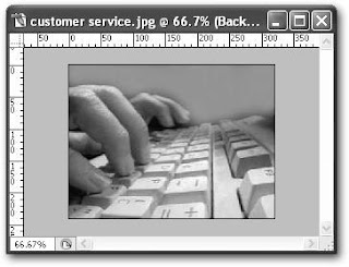
  1. Select the customer service.jpg image. It’s dark at the top of this image and light at the bottom. Let’s use some dodge and burn techniques to fix these areas of our image.
  2. In the Layers palette, select the right-facing arrow directly above the Opacity drop-down field. A submenu displays. Select New Layer, as shown in figure below. The New Layer dialog box displays.


    Tip 
    You’ll need to create a new layer using this method rather than clicking on the Create New Layer icon at the bottom of the Layers palette. The Create New Layer icon does not bring up the New Layer dialog box, while this method of selecting from the right-facing arrow does.
    For this technique to work, you’ll need to define some settings in the New Layer dialog box.
  3. In the New Layer dialog box, define the following settings:
    • Name: dodge and burn
    • Color: None
    • Mode: Overlay
    • Opacity: 100%
    • Fill with Overlay-neutral color (50% gray): checked
    Your screen should look like figure below.
  4. Press the OK button. A new layer displays above your background layer and is filled with gray. The Overlay setting, however, allows Photoshop to ignore the color. You’ll see how this all comes into play in a moment.
  5. Select the Brush tool from the toolbox (it’s the fourth tool from the top, on the right side of the toolbox).
  6. In the options bar, select the down-facing arrow next to the Brush option. A drop-down list displays, filled with the different brushes you can select.
  7. Select a soft-edged brush from this brush picker (such as Brush 65, as shown in figure below). Then, change the Opacity in the options bar to 25%.


  8. Change the foreground color in the toolbox to white.

    Tip 
    Want a shortcut for changing your foreground color to white or black? Press the letter D on your keyboard. The foreground color changes to black. To change your foreground color to white, press the letter D and then the letter X.
  9. With your Brush tool selected, select the background layer. Then, click and hold to paint over the top part of your image. If the dodge effect isn’t light enough, release your mouse and then click and hold again as you paint over the area. Your image should look something like figure below.


  10. Change the foreground color to black. Select the background layer and paint over the keyboard.
  11. Go to ImageImage Size. Change the Width and Height to 25%, then click OK. You’ve now shrunk your image.
  12. Press Ctrl+Shift+E to merge all visible layers. Then, drag it onto the San Simeon Software image, somewhere below the software image.
  13. Select the layer this software graphic is on. Change the name of the layer to customer service. Your image should look like figure below.

Creating Colored Menu Sections

In addition to the key menus available from the navigational bar, let’s add menus on the right side of the screen. We’ll place the menus on the right side in colored boxes. Try the following:
  1. Create a new layer called company.
  2. Select the Rectangular Marquee tool. Draw a small rectangle shape.
  3. Double-click the foreground color on the toolbar. The Color Picker dialog box displays. Change the RGB to 255, 185, 222 (the San Simeon Software yellow), then click OK.
  4. Click the Paint Bucket tool from the toolbar. Then click within the rectangle you just drew. Your screen should look like figure below.
  5. Create a new layer called company text.
  6. Use the same text size you used in the navigational bar text. The settings are as follows (available from WindowCharacter):
    • Font Family: Verdana
    • Font Style: Regular
    • Font Size: 14 pt
    • Leading: 100%
    • Tracking: 0
    • Color: RGB = 255, 255, 255
    • Anti-aliasing Method: Smooth
  7. Select the Text tool, then type the word Company over the yellow box. Use the Move tool to center this text if necessary. Your screen should look like figure below.


  8. Right-click on the company layer, then select Duplicate Layer. Rename your duplicate layer solutions.
  9. Select the Move tool from the toolbox. Hold the Shift key and press the Down Arrow 10 times.
  10. Select the Magic Wand tool. Click this new rectangle you just moved down the page.
  11. Double-click the foreground color in the toolbox. The Color Picker dialog box displays. Change the RGB to 249, 147, 150 (this is a nice rose color that complements the San Simeon green you used earlier), then press OK.
  12. Select the Paint Bucket tool from the toolbox. Click within the solutions rectangle. The box fills with the rose color.
  13. Right-click within the company text layer, then select Duplicate Layer. Rename your duplicate layer solutions text.
  14. Select the Move tool from the toolbox. Hold the Shift key and press the Down Arrow 10 times.
  15. Select the Text tool and highlight the text Company (that you just moved down 10 times). Type Solutions, as shown in figure below. Use the Move tool to center your text if necessary.

In this tutorial:
  1. Designing a Modern Web Page Style
  2. The Simeon Software Group
  3. Creating the Navigation Bar Layer
  4. Creating a Watermark Layer
  5. Adding Menus to the Navigational Bar
  6. Creating Colored Menu Selections
  7. Adding Photos to Your Web Page
  8. Editing your Web Page in Dreamweaver 
  9. Creating Background Images
  10. Silver and Backgrounds

Adding Menus to the Navigational Bar

Now that you’ve developed your navigational bar, let’s add some menus to it. We’ll create the following areas for our navigational menu:
  • Products
  • Services
  • Site Index
Let’s go ahead and create these now.
  1. Create a new layer called products menu.
  2. Select WindowCharacter. The Character palette displays. Enter the following information, as shown in figure below.
    • Font Family: Verdana
    • Font Style: Regular
    • Font Size: 14 pt
       
    • Leading: 100%
    • Tracking: 0
    • Color: RGB = 255, 255, 255
    • Anti-aliasing Method: Smooth
  3. Select the Text tool from the toolbox. Make sure that you are in the products menu layer, then type Products. Your screen should look similar to figure below.

  4. Right-click on the products menu layer, then select Duplicate Layer. Rename your duplicate layer services.
  5. Select the Move tool from the toolbox. Hold your Shift key and press the Down Arrow eight times.
  6. Select the Text tool and highlight the text Products (that you just moved down eight times). Type the word Services, as shown in figure below. Use the Move tool to center your text if necessary.
  7. Right-click on the services layer, then select Duplicate Layer. Rename your duplicate layer site index.
  8. Select the Move tool from the toolbox. Hold the Shift key and press the Down Arrow 10 times.
  9. Select the Text tool and highlight the text Services (that you just moved down 10 times). Type Site Index, as shown in figure below. Use the Move tool to center your text if necessary.

    In this tutorial:
    1. Designing a Modern Web Page Style
    2. The Simeon Software Group
    3. Creating the Navigation Bar Layer
    4. Creating a Watermark Layer
    5. Adding Menus to the Navigational Bar
    6. Creating Colored Menu Selections
    7. Adding Photos to Your Web Page
    8. Editing your Web Page in Dreamweaver 
    9. Creating Background Images
    10. Silver and Backgrounds

Creating a Watermark Layer

Just because the San Simeon Software group wants a minimalist website doesn’t mean this site has to be boring. Let’s create a watermark effect that will run up and down the navigational bar.
  1. Create a new layer called watermark 1.

  2. Select the Elliptical Marquee tool from the toolbox. In the options bar, make sure the Feather text box is set to 0 px.

  3. With the watermark 1 layer selected, draw an oval, as shown in figure below.


  4. In the options bar, select the Add to Selection icon. Then, click the Rectangular Marquee tool.

  5. Draw a rectangle that does not extend past the right side of the oval. Then, drag your rectangle downward. You’ve created a new watermark shape, as shown in figure below.
  6. Double-click on the foreground color from the toolbox. The Color Picker dialog box displays. Change the foreground color to white (RGB = 255, 255, 255), then press OK.
  7. Choose the Paint Bucket tool from the toolbox. Click within the watermark selection.

  8. In the watermark 1 layer, change Opacity to 20%.
  9. Press Ctrl+T to transform your watermark. Grab the right side and pull it so it’s flush with the right edge of the navigational bar, as shown in figure below.

  10. Press Ctrl+D to deselect the watermark layer.
  11. Let’s add a couple more watermarks. Right-click on the water- mark 1 layer and select Duplicate Layer. The Duplicate Layer dialog box displays.
  12. Change the name of your duplicate layer to watermark 2, then press OK. Your first watermark layer is duplicated.
  13. Select the Move tool from the toolbox. Make sure you are in the watermark 2 layer.
  14. Hold down the Shift key, then press the Down Arrow key on your keyboard 10 times. You screen should look like figure below.
In this tutorial:
  1. Designing a Modern Web Page Style
  2. The Simeon Software Group
  3. Creating the Navigation Bar Layer
  4. Creating a Watermark Layer
  5. Adding Menus to the Navigational Bar
  6. Creating Colored Menu Selections
  7. Adding Photos to Your Web Page
  8. Editing your Web Page in Dreamweaver 
  9. Creating Background Images
  10. Silver and Backgrounds

Creating the Navigation Bar Layer

After working on the new logo, let’s now create the navigational menu for the San Simeon Software group. Perform the following:
  1. Create a new layer and call it nav bar.
  2. Select the Rectangle tool from the toolbox. Draw a rectangle down the left side of the window starting right below the San Simeon logo.

  3. Right-click on the rectangle with your mouse. Then select Make Selection from the submenu.
  4. Double-click on the foreground color. The Color Picker dialog box displays. Change the RGB to 255, 185, 22 and click OK.
  5. Select the Paint Bucket tool from the toolbox. Click within the rectangle. You screen should look like figure below.
  6. Press Ctrl+D to deselect the navigational bar.

The San Simeon Software Group

In this chapter, you’ll create a modern style web page for San Simeon Software. The group at San Simeon is a serious bunch of software engineers. They want a web presence that suggests as much.

Creating a Modern Logo Layer

Modern logos often use sans-serif fonts (fonts without the fancy curly ends like those of Times New Roman). They also use white space and incorporate some bold color. Perform the following to create a logo for our friends at San Simeon Software:

  1. Fire up Photoshop. Since you’ve become more familiar with Photoshop, we’ll create all elements of your web page in one file, using multiple layers.

  2. Go to FileNew. The New dialog box displays. Enter the following information:

    • Width: 775 pixels

    • Height: 420 pixels

    • Resolution: 72 pixels/inch

    • Color Mode: RGB Color 8 bit

    • Background Contents: White

  3. Press OK. A new image window displays.

  4. Create a new layer. Name this new layer logo.

  5. Select WindowCharacter from the menu bar. The Character palette displays. Enter the following information, as shown in figure below. Then press OK:

    • Font Family: Verdana

    • Font Style: Bold

    • Font Size: 30 pt

    • Leading: (Auto)

    • Tracking: –100
       

    • Color: RGB = 82, 121, 81

    • Anti-aliasing Method: Smooth

  6. Select the Horizontal Text tool from the toolbox. Then type SanSimeonSoftware toward the upper-left side of your blank image.
    Don’t use any spaces. Type all the words together, as shown in figure below.


  7. Select the Horizontal Text tool and use it to highlight the “Software” portion of your logo.

  8. Double-click the foreground from the toolbar. The Color Picker dialog box displays. Change the RGB to 255, 185, 22 and press OK. The “Software” portion of your logo changes to yellow, as shown in figure below.

Now that you’ve created your logo, let’s move on to creating the rest of the site.

Tip 
A company’s logo will often set the tone for the rest of a website. Thus, when finding the right style for a client’s website, the first place to start is the look and feel of their logo.


In this tutorial:
  1. Designing a Modern Web Page Style
  2. The Simeon Software Group
  3. Creating the Navigation Bar Layer
  4. Creating a Watermark Layer
  5. Adding Menus to the Navigational Bar
  6. Creating Colored Menu Selections
  7. Adding Photos to Your Web Page
  8. Editing your Web Page in Dreamweaver 
  9. Creating Background Images
  10. Silver and Backgrounds

Designing a “Modern” Web Page Style

The style and flavor of what’s popular in web design is constantly in flux. A couple years ago, people loved flowery graphical imagery, such as realistic textures, beveling, and shadows.

Many sites today are using sans-serif fonts, mono or duo-colored areas, text saved as pictures, and objects that don’t cast shadows in place of flowery graphical pages.

This modern style has become more and more popular these days, with information arranged into neatly aligned tables. This tutorial explores creating a modern styled web page.

In this tutorial:
  1. Designing a Modern Web Page Style
  2. The Simeon Software Group
  3. Creating the Navigation Bar Layer
  4. Creating a Watermark Layer
  5. Adding Menus to the Navigational Bar
  6. Creating Colored Menu Selections
  7. Adding Photos to Your Web Page
  8. Editing your Web Page in Dreamweaver 
  9. Creating Background Images
  10. Silver and Backgrounds

Thursday, July 29, 2010

Editing Your Web Page in Dreamweaver

Let’s finish your page with some text. We’ll open your HTML file in Dreamweaver and add a title and content to your web page.
  1. Fire up Dreamweaver. Open your Jackson_home.html page.
  2. Select the navigation bar image and press the Delete key on your keyboard.
  3. Press the background folder icon in Dreamweaver (it resides next to the first Bg text field located within the Properties inspector). An explorer window displays, allowing you to navigate to your files.
  4. Navigate to the images folder. You’ll find this folder in the same location as the Jackson_home.html file. Photoshop automatically creates an images folder whenever you slice images and save them for the web.
  5. Find the image for your navigation bar. Select the image and you’ll find it now fills in the Bg text field.
  6. Repeat steps 2 through 5, deleting and then selecting the appropriate images for the contents window graphic and the About Jackson Steel graphic. Setting your images in the Bg text field allows you to type text over them, which is useful when adding content to your web pages.


  7. Select InsertTable from the menu bar in Dreamweaver. The Table dialog box displays.
  8. Define the following, as shown in figure below.
    • Rows: 1
    • Columns: 2
    • Border thickness: 0
    • Cell padding: 0
    • Cell spacing: 0
       
    Defining a table in this manner allows you to align your text in straight columns and rows. You won’t see the table at all with the thickness, padding, and spacing set to 0.
  9. Create a similar table over the navigation bar. You can set the horizontal and vertical alignment at the bottom of the screen (where you set the background information). Use your mouse to click and drag the sizes of your table.
    After performing these tasks, your tables should look something like figure below.
Add various text within your page. You might want to delete the About Jackson Steel graphic and type in a title using Dream- weaver. I’ve done just that in figure above using a Bold Verdana font.
A text title will allow you to easily use this page over and over again to create new pages for this website. Say you want to add a Contacts page.
Just save this web page with a different file name in Dreamweaver (perhaps changing it to Jackson_contacts.html). Then, all you have to do is change the text title to Contacts and you’re ready to go. This beats having to create a new text graphic in Photoshop every time you need to create a new web page.
Figure below shows the final result of your web page. It’s ready now to save and launch on the World Wide Web.
In this tutorial:
  1. Creating a Professional Web Page Style
  2. The Navigation Bar/Title Bar Style
  3. Creating a Metallic Navigation Bar
  4. Creating a Logo 
  5. Adding a Steel Plate Graphic to your Web 
  6. Creating a Contents Area 
  7. Creating Slices in Photoshop 
  8. Editing your Web Page in Dreamweaver