Add a Down State
A rollover can have multiple states. Next you'll add a Down state to this rollover button. The Down state occurs in a Web browser when a viewer clicks and holds on an area defined by a slice.
| Changing States. States are applied in a default order (Over, Down, Selected, Out, Up, Click), but you can change a state to another at any time. Double-click a state in the Web Content palette. In the Rollover State Options palette that opens choose another state and click OK. |
With the Over state of the btn1 slice selected in the Web Content palette, click the Create New Rollover State icon at the bottom of that palette
A. The new Down state
B starts out looking just like the Over state.
Change the Look of the Down State
With the Down state selected in the Web Content palette A, change the appearance of the button again by clicking the 01_roll_down style in the Styles palette B. Preview the Down state by activating the Preview button in the toolbox, and clicking and holding the first Link button in the image C. Exit preview.
Create a Rollover Style
Now you'll save all the states of your rollover as a reusable rollover style. With the Button1 layer selected in the Layers palette A, click the Create New Style icon at the bottom of the Styles palette B. In the Style Options dialog box that opens, make sure Include Layer Effects, Include Blending Options, and Include Rollover States are checked to retain all the content and functionality of your original rollover C. Name the style 01_triple_roll, and click OK. The style appears in the Styles palette with a black triangle, which indicates that it's a rollover style rather than a static style D.
Apply the Rollover Style to Button2
Now you'll reap the rewards of your hard work. It's quick and easy to create a set of matching rollover buttons by applying the rollover style to the other two buttons in this navigation bar.
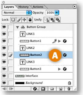
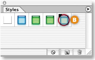
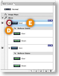
Select the Button2 layer in the Layers palette A. In the Styles palette, click the new rollover style 01_triple_roll B. This creates a layer-based slice around the content of the Button2 layer C, generates an Over state and a Down state for this slice along with the JavaScript to make the states function, and changes the appearance of the button on each state—all with a single click. Click the triangle next to the new slice in the Web Content palette to see the rollover states for the new slice D. Double-click the slice name and rename this slice btn2 E.

Apply the Rollover Style to Button3
Repeat the preceding step with the Button3 layer selected to complete your set of rollover buttons. Rename the resulting slice btn3.
Preview in a Web Browser
Click the Preview in Browser button in the toolbox to test your rollovers in your default Web browser.
Optimize and Save
Optimize each slice for fast download using the settings in the Optimize palette. When you optimize a slice, you affect all states of its rollover, so check the appearance of all three states of the rollover buttons. Choose File>Save Optimized As. In the Save Optimized As dialog box, set Format to HTML and Images A so that ImageReady generates an HTML file containing the JavaScript that will make your rollovers function. (If you prefer to create rollovers in a site-building program or write your own JavaScript, choose Format: Images Only.) In addition, the program creates an Image folder in which it saves GIFs and JPEGs from the slices and rollovers in the source file B.
Choose File>Save to resave the PSD file with all of the slicing and rollover information you've added.


Rollover navigation so ncie this . Thanks for this amazing post ..
ReplyDelete