


Let’s say I want my layer style to match the pattern on the wood, for an etched effect of some sort. The first thing I want to do is go to Edit>Define Pattern and save the image as a custom pattern to use in a few minutes.

I’ll create a new type layer above the background. The color of the type really isn’t important.

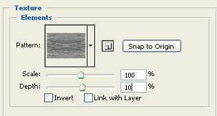
Before breaking out the carving tools, I’ll open the Layer Styles dialog box for the type layer and overlay the text with my pattern. The important thing here is that the grain matches the background, so with the Scale set to 100% I’ll uncheck Link with Layer and press the Snap to Origin button. The type will now be invisible in the image as the pattern overlay is perfectly blended to the background.


Now I will apply the default Bevel by simply turning it on in the Layer Styles dialog box. The type begins to appear, looking embossed in the wood with soft, sanded edges.

Changing the character of the Bevel by manipulating the bevel and embossed settings as seen in the screen capture below is simply the result of trial and error.

By manipulating the direction of the lighting, the amount of the bevel, the type of bevel, and the colors applied as shadows and highlights, the type now appears to be etched from the surface of the wood or stamped into the wood texture.

As it appears now, the type still seems sanded or soft. This can be changed and’ roughened up a bit’ by using the same pattern as an applied texture. Again my settings are seen in the capture below. As with the pattern overlay, uncheck Link with Layer before clicking on Snap to Origin.
An inner glow with the blend mode set to Multiply and the color changed to a dark brownish gray will help with the illusion of depth.

A gradient overlay will also help in this regard.

I will move my layers palette to the side so we can better see what is going on with the text.

As I’m working with a 300 ppi image, I’m going to apply a slight blur to remove some jaggies… I’ll leave that up to you though.

Keep in mind this is still simply a type layer with some white text: all we've done is added a few extra characteristics. Any of these effects we can simply turn on or turn off via the Layer Styles dialog box.
Another cool trick we can use to alter the appearance of our text and how it relates to the wood beneath the is to change our bevel options. There is an option in the bevel and emboss settings that allows us to apply the bevel to a stroke. Knowing what we do about Photoshop, we can use a pattern to stroke (or outline) the text. Hmmmmm..
Let's give that a try and see what happens. I'll open the stroke options in the Layer Styles dialog box and simply apply a patterned stroke, using the pattern we created and have used over and over again.

Now I will change the settings in the Bevel/Emboss area to accommodate the new Pattern Stroke.


Say you want to change the character of the actual etching. For instance, instead of text that is carved deep into the surface of the wood, you add like to experiment with variations that would change the manner in which the carving appears. Does that make sense? If not, allow me to demonstrate. By adding and adjusting a contour, similar to the way you would adjust a Curve, you can change the appearance of the bevel and the actual carving or etching. The example below demonstrates a Contour that I've created and will apply to this text from the Layer Styles dialog box.

Here is the result:

Now instead of the text appearing etched into the surface, it appears embossed from the surface. Or rather, the edges of the text appear embossed from the surface. Simply by changing the direction of the light apply to the bevel will again drastically change the character of the text on the wood.


To complete the effect on simply going to add some digital wear and tear around the type, using Outer Glow to apply a little grunge.


I hope you see how it small changes to layer styles can have markedly different results.
awesome!
ReplyDeletethank you :)
ReplyDeleteThese wood textures are looks creative .
ReplyDelete
ReplyDeleteChitta Kurta Karan Aujla and Gurlez Akhtar
For all Punjabi music fans, check-out latest Punjabi song ‘Chitta Kurta’ sung by Karan Aujla and Gurlez Akhtar and music is given by Deep Jandu. Watch the video to know more about song . Check out Etimes Punjabi music videos section for more Punjabi songs, Karan Aujla New song, Gurlez Akhtar songs, and other Punjabi latest songs.
chita kurta karan aujla mp3 download
mar gaye oye loko full movie download
punjabi Epaper
chitta kurta karan aujla mp3
chitta kurta karan aujla song download
chitta kurta karan aujla mp3 download
chitta kurta by karan aujla mp3 download
khatarnak gippy grewal djjohal
khatarnak gippy grewal mp3 download
gippy grewal new song khatarnak
khatarnak gippy grewal mp3
khatarnak gippy grewal song download
khatarnak bohemia mp3
khatarnak gippy grewal mp3 song download
khatarnak gippy mp3
chitta kurta karan aujla
chitta kurta karan aujla mp3 song download
karan aujla chita kurta song download
Azad soch punjabi news
punjabi newspaper
punjabi newspaper
karan aujla new song chitta kurta download
Chitta Kurta Latest Punjabi Song By Karan Aujla
You have a way of making complex topics simple
ReplyDelete